Deprecated: Using ${var} in strings is deprecated, use {$var} instead in /home/linweb13/g/graphicidea.co.uk-1057514441/user/htdocs/wp-content/themes/Divi/includes/builder/module/settings/migration/ColumnOptions.php on line 95
Deprecated: Using ${var} in strings is deprecated, use {$var} instead in /home/linweb13/g/graphicidea.co.uk-1057514441/user/htdocs/wp-content/themes/Divi/includes/builder/module/settings/migration/ColumnOptions.php on line 95
Deprecated: Using ${var} in strings is deprecated, use {$var} instead in /home/linweb13/g/graphicidea.co.uk-1057514441/user/htdocs/wp-content/themes/Divi/includes/builder/module/settings/migration/ColumnOptions.php on line 97
Deprecated: Using ${var} in strings is deprecated, use {$var} instead in /home/linweb13/g/graphicidea.co.uk-1057514441/user/htdocs/wp-content/themes/Divi/includes/builder/module/settings/migration/ColumnOptions.php on line 97
Deprecated: Using ${var} in strings is deprecated, use {$var} instead in /home/linweb13/g/graphicidea.co.uk-1057514441/user/htdocs/wp-content/themes/Divi/includes/builder/module/settings/migration/ColumnOptions.php on line 103
Deprecated: Using ${var} in strings is deprecated, use {$var} instead in /home/linweb13/g/graphicidea.co.uk-1057514441/user/htdocs/wp-content/themes/Divi/includes/builder/module/settings/migration/ColumnOptions.php on line 103
Deprecated: Using ${var} in strings is deprecated, use {$var} instead in /home/linweb13/g/graphicidea.co.uk-1057514441/user/htdocs/wp-content/themes/Divi/includes/builder/module/settings/migration/ColumnOptions.php on line 105
Deprecated: Using ${var} in strings is deprecated, use {$var} instead in /home/linweb13/g/graphicidea.co.uk-1057514441/user/htdocs/wp-content/themes/Divi/includes/builder/module/settings/migration/ColumnOptions.php on line 105
Deprecated: Using ${var} in strings is deprecated, use {$var} instead in /home/linweb13/g/graphicidea.co.uk-1057514441/user/htdocs/wp-content/themes/Divi/includes/builder/module/settings/migration/ColumnOptions.php on line 130
Deprecated: Using ${var} in strings is deprecated, use {$var} instead in /home/linweb13/g/graphicidea.co.uk-1057514441/user/htdocs/wp-content/themes/Divi/includes/builder/module/settings/migration/ColumnOptions.php on line 130
Deprecated: Using ${var} in strings is deprecated, use {$var} instead in /home/linweb13/g/graphicidea.co.uk-1057514441/user/htdocs/wp-content/themes/Divi/includes/builder/module/settings/migration/ColumnOptions.php on line 132
Deprecated: Using ${var} in strings is deprecated, use {$var} instead in /home/linweb13/g/graphicidea.co.uk-1057514441/user/htdocs/wp-content/themes/Divi/includes/builder/module/settings/migration/ColumnOptions.php on line 132
Deprecated: Using ${var} in strings is deprecated, use {$var} instead in /home/linweb13/g/graphicidea.co.uk-1057514441/user/htdocs/wp-content/themes/Divi/includes/builder/module/settings/migration/ColumnOptions.php on line 161
Deprecated: Using ${var} in strings is deprecated, use {$var} instead in /home/linweb13/g/graphicidea.co.uk-1057514441/user/htdocs/wp-content/themes/Divi/includes/builder/module/settings/migration/ColumnOptions.php on line 161
Deprecated: Using ${var} in strings is deprecated, use {$var} instead in /home/linweb13/g/graphicidea.co.uk-1057514441/user/htdocs/wp-content/themes/Divi/includes/builder/module/settings/migration/ColumnOptions.php on line 161
Deprecated: Using ${var} in strings is deprecated, use {$var} instead in /home/linweb13/g/graphicidea.co.uk-1057514441/user/htdocs/wp-content/themes/Divi/includes/builder/module/settings/migration/ColumnOptions.php on line 162
Deprecated: Using ${var} in strings is deprecated, use {$var} instead in /home/linweb13/g/graphicidea.co.uk-1057514441/user/htdocs/wp-content/themes/Divi/includes/builder/module/settings/migration/ColumnOptions.php on line 162
Deprecated: Using ${var} in strings is deprecated, use {$var} instead in /home/linweb13/g/graphicidea.co.uk-1057514441/user/htdocs/wp-content/themes/Divi/includes/builder/module/settings/migration/ColumnOptions.php on line 162
Deprecated: Using ${var} in strings is deprecated, use {$var} instead in /home/linweb13/g/graphicidea.co.uk-1057514441/user/htdocs/wp-content/themes/Divi/includes/builder/module/settings/migration/ColumnOptions.php on line 205
Deprecated: Using ${var} in strings is deprecated, use {$var} instead in /home/linweb13/g/graphicidea.co.uk-1057514441/user/htdocs/wp-content/themes/Divi/includes/builder/module/settings/migration/ColumnOptions.php on line 205
Deprecated: Using ${var} in strings is deprecated, use {$var} instead in /home/linweb13/g/graphicidea.co.uk-1057514441/user/htdocs/wp-content/themes/Divi/includes/builder/module/settings/migration/ColumnOptions.php on line 205
Deprecated: Using ${var} in strings is deprecated, use {$var} instead in /home/linweb13/g/graphicidea.co.uk-1057514441/user/htdocs/wp-content/themes/Divi/includes/builder/module/settings/migration/ColumnOptions.php on line 205
Deprecated: Using ${var} in strings is deprecated, use {$var} instead in /home/linweb13/g/graphicidea.co.uk-1057514441/user/htdocs/wp-content/themes/Divi/includes/builder/module/settings/migration/ColumnOptions.php on line 207
Deprecated: Using ${var} in strings is deprecated, use {$var} instead in /home/linweb13/g/graphicidea.co.uk-1057514441/user/htdocs/wp-content/themes/Divi/includes/builder/module/settings/migration/ColumnOptions.php on line 207
Deprecated: Using ${var} in strings is deprecated, use {$var} instead in /home/linweb13/g/graphicidea.co.uk-1057514441/user/htdocs/wp-content/themes/Divi/includes/builder/module/settings/migration/ColumnOptions.php on line 207
Deprecated: Creation of dynamic property ET_Builder_Section::$_original_content is deprecated in /home/linweb13/g/graphicidea.co.uk-1057514441/user/htdocs/wp-content/themes/Divi/includes/builder/class-et-builder-element.php on line 1315
Deprecated: Creation of dynamic property ET_Builder_Module_Field_Border::$template is deprecated in /home/linweb13/g/graphicidea.co.uk-1057514441/user/htdocs/wp-content/themes/Divi/includes/builder/module/field/Border.php on line 48
Deprecated: Using ${var} in strings is deprecated, use {$var} instead in /home/linweb13/g/graphicidea.co.uk-1057514441/user/htdocs/wp-content/themes/Divi/includes/builder/module/field/Position.php on line 198
Deprecated: Using ${var} in strings is deprecated, use {$var} instead in /home/linweb13/g/graphicidea.co.uk-1057514441/user/htdocs/wp-content/themes/Divi/includes/builder/module/field/Position.php on line 199
Deprecated: Using ${var} in strings is deprecated, use {$var} instead in /home/linweb13/g/graphicidea.co.uk-1057514441/user/htdocs/wp-content/themes/Divi/includes/builder/module/field/Position.php on line 200
Deprecated: Using ${var} in strings is deprecated, use {$var} instead in /home/linweb13/g/graphicidea.co.uk-1057514441/user/htdocs/wp-content/themes/Divi/includes/builder/module/field/Position.php on line 499
Deprecated: Using ${var} in strings is deprecated, use {$var} instead in /home/linweb13/g/graphicidea.co.uk-1057514441/user/htdocs/wp-content/themes/Divi/includes/builder/module/field/Position.php on line 582
Deprecated: Using ${var} in strings is deprecated, use {$var} instead in /home/linweb13/g/graphicidea.co.uk-1057514441/user/htdocs/wp-content/themes/Divi/includes/builder/module/field/Transform.php on line 79
Deprecated: Using ${var} in strings is deprecated, use {$var} instead in /home/linweb13/g/graphicidea.co.uk-1057514441/user/htdocs/wp-content/themes/Divi/includes/builder/module/field/Transform.php on line 79
Deprecated: Using ${var} in strings is deprecated, use {$var} instead in /home/linweb13/g/graphicidea.co.uk-1057514441/user/htdocs/wp-content/themes/Divi/includes/builder/module/field/Transform.php on line 98
Deprecated: Using ${var} in strings is deprecated, use {$var} instead in /home/linweb13/g/graphicidea.co.uk-1057514441/user/htdocs/wp-content/themes/Divi/includes/builder/module/field/Transform.php on line 98
Deprecated: Using ${var} in strings is deprecated, use {$var} instead in /home/linweb13/g/graphicidea.co.uk-1057514441/user/htdocs/wp-content/themes/Divi/includes/builder/module/field/Transform.php on line 117
Deprecated: Using ${var} in strings is deprecated, use {$var} instead in /home/linweb13/g/graphicidea.co.uk-1057514441/user/htdocs/wp-content/themes/Divi/includes/builder/module/field/Transform.php on line 117
Deprecated: Using ${var} in strings is deprecated, use {$var} instead in /home/linweb13/g/graphicidea.co.uk-1057514441/user/htdocs/wp-content/themes/Divi/includes/builder/module/field/Transform.php on line 117
Deprecated: Using ${var} in strings is deprecated, use {$var} instead in /home/linweb13/g/graphicidea.co.uk-1057514441/user/htdocs/wp-content/themes/Divi/includes/builder/module/field/Transform.php on line 136
Deprecated: Using ${var} in strings is deprecated, use {$var} instead in /home/linweb13/g/graphicidea.co.uk-1057514441/user/htdocs/wp-content/themes/Divi/includes/builder/module/field/Transform.php on line 136
Deprecated: Using ${var} in strings is deprecated, use {$var} instead in /home/linweb13/g/graphicidea.co.uk-1057514441/user/htdocs/wp-content/themes/Divi/includes/builder/module/field/Transform.php on line 157
Deprecated: Using ${var} in strings is deprecated, use {$var} instead in /home/linweb13/g/graphicidea.co.uk-1057514441/user/htdocs/wp-content/themes/Divi/includes/builder/module/field/Transform.php on line 157
Deprecated: Using ${var} in strings is deprecated, use {$var} instead in /home/linweb13/g/graphicidea.co.uk-1057514441/user/htdocs/wp-content/themes/Divi/includes/builder/module/field/Transform.php on line 199
Deprecated: Using ${var} in strings is deprecated, use {$var} instead in /home/linweb13/g/graphicidea.co.uk-1057514441/user/htdocs/wp-content/themes/Divi/includes/builder/module/field/Transform.php on line 200
Deprecated: Using ${var} in strings is deprecated, use {$var} instead in /home/linweb13/g/graphicidea.co.uk-1057514441/user/htdocs/wp-content/themes/Divi/includes/builder/module/field/Transform.php on line 201
Deprecated: Using ${var} in strings is deprecated, use {$var} instead in /home/linweb13/g/graphicidea.co.uk-1057514441/user/htdocs/wp-content/themes/Divi/includes/builder/module/field/Transform.php on line 203
Deprecated: Using ${var} in strings is deprecated, use {$var} instead in /home/linweb13/g/graphicidea.co.uk-1057514441/user/htdocs/wp-content/themes/Divi/includes/builder/module/field/Transform.php on line 204
Deprecated: Using ${var} in strings is deprecated, use {$var} instead in /home/linweb13/g/graphicidea.co.uk-1057514441/user/htdocs/wp-content/themes/Divi/includes/builder/module/field/Transform.php on line 205
Deprecated: Using ${var} in strings is deprecated, use {$var} instead in /home/linweb13/g/graphicidea.co.uk-1057514441/user/htdocs/wp-content/themes/Divi/includes/builder/module/field/Transform.php on line 206
Deprecated: Using ${var} in strings is deprecated, use {$var} instead in /home/linweb13/g/graphicidea.co.uk-1057514441/user/htdocs/wp-content/themes/Divi/includes/builder/module/field/Transform.php on line 207
Deprecated: Using ${var} in strings is deprecated, use {$var} instead in /home/linweb13/g/graphicidea.co.uk-1057514441/user/htdocs/wp-content/themes/Divi/includes/builder/module/field/Transform.php on line 364
Deprecated: Using ${var} in strings is deprecated, use {$var} instead in /home/linweb13/g/graphicidea.co.uk-1057514441/user/htdocs/wp-content/themes/Divi/includes/builder/module/field/Transform.php on line 364
Deprecated: Using ${var} in strings is deprecated, use {$var} instead in /home/linweb13/g/graphicidea.co.uk-1057514441/user/htdocs/wp-content/themes/Divi/includes/builder/module/field/Transform.php on line 565
Deprecated: Creation of dynamic property ET_Builder_Module_Helper_MultiViewOptions::$inherited_props is deprecated in /home/linweb13/g/graphicidea.co.uk-1057514441/user/htdocs/wp-content/themes/Divi/includes/builder/module/helpers/MultiViewOptions.php on line 686
Deprecated: Creation of dynamic property ET_Builder_Module_Field_Divider::$count is deprecated in /home/linweb13/g/graphicidea.co.uk-1057514441/user/htdocs/wp-content/themes/Divi/includes/builder/main-structure-elements.php on line 1498
Deprecated: Creation of dynamic property ET_Builder_Row::$_original_content is deprecated in /home/linweb13/g/graphicidea.co.uk-1057514441/user/htdocs/wp-content/themes/Divi/includes/builder/class-et-builder-element.php on line 1315
Deprecated: Creation of dynamic property ET_Builder_Column::$_original_content is deprecated in /home/linweb13/g/graphicidea.co.uk-1057514441/user/htdocs/wp-content/themes/Divi/includes/builder/class-et-builder-element.php on line 1315
Deprecated: Creation of dynamic property ET_Builder_Module_Button::$text_shadow is deprecated in /home/linweb13/g/graphicidea.co.uk-1057514441/user/htdocs/wp-content/themes/Divi/includes/builder/class-et-builder-element.php on line 1315
Deprecated: Creation of dynamic property ET_Builder_Module_Button::$margin_padding is deprecated in /home/linweb13/g/graphicidea.co.uk-1057514441/user/htdocs/wp-content/themes/Divi/includes/builder/class-et-builder-element.php on line 1315
Deprecated: Creation of dynamic property ET_Builder_Module_Button::$_additional_fields_options is deprecated in /home/linweb13/g/graphicidea.co.uk-1057514441/user/htdocs/wp-content/themes/Divi/includes/builder/class-et-builder-element.php on line 1315
Deprecated: Creation of dynamic property ET_Builder_Module_Button::$_original_content is deprecated in /home/linweb13/g/graphicidea.co.uk-1057514441/user/htdocs/wp-content/themes/Divi/includes/builder/class-et-builder-element.php on line 1315
Deprecated: Creation of dynamic property ET_Builder_Module_Helper_MultiViewOptions::$inherited_props is deprecated in /home/linweb13/g/graphicidea.co.uk-1057514441/user/htdocs/wp-content/themes/Divi/includes/builder/module/helpers/MultiViewOptions.php on line 686
Deprecated: Creation of dynamic property ET_Builder_Module_Gallery::$text_shadow is deprecated in /home/linweb13/g/graphicidea.co.uk-1057514441/user/htdocs/wp-content/themes/Divi/includes/builder/class-et-builder-element.php on line 1315
Deprecated: Creation of dynamic property ET_Builder_Module_Gallery::$margin_padding is deprecated in /home/linweb13/g/graphicidea.co.uk-1057514441/user/htdocs/wp-content/themes/Divi/includes/builder/class-et-builder-element.php on line 1315
Deprecated: Creation of dynamic property ET_Builder_Module_Gallery::$_additional_fields_options is deprecated in /home/linweb13/g/graphicidea.co.uk-1057514441/user/htdocs/wp-content/themes/Divi/includes/builder/class-et-builder-element.php on line 1315
Deprecated: Creation of dynamic property ET_Builder_Module_Gallery::$_original_content is deprecated in /home/linweb13/g/graphicidea.co.uk-1057514441/user/htdocs/wp-content/themes/Divi/includes/builder/class-et-builder-element.php on line 1315
Deprecated: Creation of dynamic property ET_Builder_Module_Helper_MultiViewOptions::$inherited_props is deprecated in /home/linweb13/g/graphicidea.co.uk-1057514441/user/htdocs/wp-content/themes/Divi/includes/builder/module/helpers/MultiViewOptions.php on line 686
Deprecated: Creation of dynamic property WP_Post::$image_alt_text is deprecated in /home/linweb13/g/graphicidea.co.uk-1057514441/user/htdocs/wp-content/themes/Divi/includes/builder/module/Gallery.php on line 466
Deprecated: Creation of dynamic property WP_Post::$image_src_full is deprecated in /home/linweb13/g/graphicidea.co.uk-1057514441/user/htdocs/wp-content/themes/Divi/includes/builder/module/Gallery.php on line 467
Deprecated: Creation of dynamic property WP_Post::$image_src_thumb is deprecated in /home/linweb13/g/graphicidea.co.uk-1057514441/user/htdocs/wp-content/themes/Divi/includes/builder/module/Gallery.php on line 468
Deprecated: Creation of dynamic property ET_Builder_Module_Text::$text_shadow is deprecated in /home/linweb13/g/graphicidea.co.uk-1057514441/user/htdocs/wp-content/themes/Divi/includes/builder/class-et-builder-element.php on line 1315
Deprecated: Creation of dynamic property ET_Builder_Module_Text::$margin_padding is deprecated in /home/linweb13/g/graphicidea.co.uk-1057514441/user/htdocs/wp-content/themes/Divi/includes/builder/class-et-builder-element.php on line 1315
Deprecated: Creation of dynamic property ET_Builder_Module_Text::$_additional_fields_options is deprecated in /home/linweb13/g/graphicidea.co.uk-1057514441/user/htdocs/wp-content/themes/Divi/includes/builder/class-et-builder-element.php on line 1315
Deprecated: Creation of dynamic property ET_Builder_Module_Text::$_original_content is deprecated in /home/linweb13/g/graphicidea.co.uk-1057514441/user/htdocs/wp-content/themes/Divi/includes/builder/class-et-builder-element.php on line 1315
Deprecated: Creation of dynamic property ET_Builder_Module_Helper_MultiViewOptions::$inherited_props is deprecated in /home/linweb13/g/graphicidea.co.uk-1057514441/user/htdocs/wp-content/themes/Divi/includes/builder/module/helpers/MultiViewOptions.php on line 686
Website design with stunning logo
First of all, we designed a logo and soon our website design was completed. It includes gorgeous photography and an online shop. Making use of a contemporary font that has a fantasy feel to it. The dot in the lettering and the subtle flame on the “I” creating a primitive fire torch. It added to the adventure aspect of this logo which it really needed. Using these fantastic images on the home page really shows them off well.
Creative Quest – Design is our passion as well as with Dungeons and Dragons so we created these decorative book boxes. Their items have a rich waxed finish as a result they are creating a bit of a buzz in the role play gaming community.
The designers of of these stunning dice boxes, Claudia and Bobby started out making their own book boxes to contain their dice addiction. A great place to keep your dice, notes, minis and pencils for Dungeons and Dragons and other RPG games.
Website Design features the photography well
Bobby art directed and shot all the photos in this beautiful collection and as a result he knew exactly what was required. The designs featured in this site include themes like gothic, antique, steampunk, dragons, skulls, trees and Celtic books. They make great gifts for someone special our to their versatility. We drew inspiration from fantastic books and shows like Vikings and Game of Thrones and Youtube show Critical Role.
Magical website design
The dragon eyes are hand painted and consequently no eye is ever the same as another. We will continue to innovate and find new ideas inspired by our favourite fantasy books like the Lord of the Rings and Harry Potter.
In conclusion what an amazing project to be involved with and consequently these stunning designs made it easy to be inspired.
Creative Quest is a new business with a great product.
Deprecated: Creation of dynamic property ET_Builder_Module_Helper_MultiViewOptions::$inherited_props is deprecated in /home/linweb13/g/graphicidea.co.uk-1057514441/user/htdocs/wp-content/themes/Divi/includes/builder/module/helpers/MultiViewOptions.php on line 686
Deprecated: Creation of dynamic property ET_Builder_Module_Helper_MultiViewOptions::$inherited_props is deprecated in /home/linweb13/g/graphicidea.co.uk-1057514441/user/htdocs/wp-content/themes/Divi/includes/builder/module/helpers/MultiViewOptions.php on line 686
Deprecated: Creation of dynamic property ET_Builder_Module_Helper_MultiViewOptions::$inherited_props is deprecated in /home/linweb13/g/graphicidea.co.uk-1057514441/user/htdocs/wp-content/themes/Divi/includes/builder/module/helpers/MultiViewOptions.php on line 686
Deprecated: Creation of dynamic property WP_Post::$image_alt_text is deprecated in /home/linweb13/g/graphicidea.co.uk-1057514441/user/htdocs/wp-content/themes/Divi/includes/builder/module/Gallery.php on line 466
Deprecated: Creation of dynamic property WP_Post::$image_src_full is deprecated in /home/linweb13/g/graphicidea.co.uk-1057514441/user/htdocs/wp-content/themes/Divi/includes/builder/module/Gallery.php on line 467
Deprecated: Creation of dynamic property WP_Post::$image_src_thumb is deprecated in /home/linweb13/g/graphicidea.co.uk-1057514441/user/htdocs/wp-content/themes/Divi/includes/builder/module/Gallery.php on line 468
Deprecated: Creation of dynamic property ET_Builder_Module_Helper_MultiViewOptions::$inherited_props is deprecated in /home/linweb13/g/graphicidea.co.uk-1057514441/user/htdocs/wp-content/themes/Divi/includes/builder/module/helpers/MultiViewOptions.php on line 686
Logo design
Regal Linen – A logo design and branding were created for Regal Linen. A vintage yet most noteworthy prestigious company based in Bond Street & Marylebone London.
First of all Regal Linen stocks beautiful English and French linen, lace, textiles and vintage victorian period cloths. They supply variety of clothing often used in theatrical productions due to high demand. As well as quality embroidery for bridal wear and weddings. They retail vintage Victoriano amongst other Victorian linens and clothing. This company supply textiles, linens and vintage clothing to movie and television companies. Consequently supplying for period dramas like Downton Abbey and Sense & Sensibility.
The Brief – Firstly design a sophisticated, modern yet time relative logo and branding. Carry the logo design and branding through to a responsive website in addition making it look great on an iPhone and iPad too. Use vintage colours with a look that flows seamlessly into another contemporary hence modern day look. The website should be something special but especially relevant it should say regal yet stylish.
Affordable web and logo design
Having designed the strong elegant logo and brand ourselves, being tasked with designing the responsive website was ideal. Working with a good brand makes designing the look of the website a pleasure. Her gorgeous retro colours and beautiful logo design look stunning on the website. The use of the classic zig zag scissor pattern, wideley associated with textiles and fabrics is a delightful addition. Close-up images of linen, lace and vintage jewellery make the site look sublime as much as high-end.
We have many logo design examples featured on our website in the portfolio section. Have a look at the sort of design quality you can expect. We utilised the ‘fleur de lis’ incorporating it into the crown logo icon thus enhancing its link to textile design. Using the crown as a focal point for the logo design and branding helped the design as a whole.
Added to that the Regal and Linen in gold looks so fine. In addition a typeface that seems like it belongs next to the crown, in all its splendour. This logo design almost made the branding and stationery design rather easy to follow with the luxurious and splendid look.
Logo design and branding
The envelope is of course theatrically sealed with scarlet wax just like those magical vintage days of no internet, smartphones and computers. As a result the overall look is probably as special as it is regal since they deal with fine linen and lace.
In conclusion we have created a logo design and branding, stationery, a responsive website and marketing leaflets, consequently we also helped design their store. A shop in London which has all the vintage garments you could wish for and maybe could have updated their logo design years ago. If you need advice about a logo or branding why not send us a message or give us a visit, our agency is close to Leighton Buzzard, Luton and Milton Keynes business centres.
Apple Macs and iPhones
This charming company also wanted to bring their technology “kicking and screaming” into the present day. So we plugged them into the exciting world of Apple Mac technology. All new MacBooks, iPhones and iPads all linked to one another through Apple IDs. A little training on the new setup and they were connected. Backup solution in place. After all the design changes and Apple Mac training they never looked back.
Most noteworthy, we look after all their graphic and website design maintenance therefore their look is always top quality and regal.
Why not call us about your Apple Mac or iPhone, we cover Bedfordshire and the whole of the UK. Our areas include Milton Keynes, Leighton Buzzard, Northampton, Aylesbury, Welwyn Garden City, Watford and Luton in Bedfordshire.
They have been our design clients since 2004.
Deprecated: Creation of dynamic property ET_Builder_Module_Helper_MultiViewOptions::$inherited_props is deprecated in /home/linweb13/g/graphicidea.co.uk-1057514441/user/htdocs/wp-content/themes/Divi/includes/builder/module/helpers/MultiViewOptions.php on line 686
Deprecated: Creation of dynamic property ET_Builder_Module_Helper_MultiViewOptions::$inherited_props is deprecated in /home/linweb13/g/graphicidea.co.uk-1057514441/user/htdocs/wp-content/themes/Divi/includes/builder/module/helpers/MultiViewOptions.php on line 686
Deprecated: Creation of dynamic property ET_Builder_Module_Helper_MultiViewOptions::$inherited_props is deprecated in /home/linweb13/g/graphicidea.co.uk-1057514441/user/htdocs/wp-content/themes/Divi/includes/builder/module/helpers/MultiViewOptions.php on line 686
Deprecated: Creation of dynamic property WP_Post::$image_alt_text is deprecated in /home/linweb13/g/graphicidea.co.uk-1057514441/user/htdocs/wp-content/themes/Divi/includes/builder/module/Gallery.php on line 466
Deprecated: Creation of dynamic property WP_Post::$image_src_full is deprecated in /home/linweb13/g/graphicidea.co.uk-1057514441/user/htdocs/wp-content/themes/Divi/includes/builder/module/Gallery.php on line 467
Deprecated: Creation of dynamic property WP_Post::$image_src_thumb is deprecated in /home/linweb13/g/graphicidea.co.uk-1057514441/user/htdocs/wp-content/themes/Divi/includes/builder/module/Gallery.php on line 468
Deprecated: Creation of dynamic property ET_Builder_Module_Helper_MultiViewOptions::$inherited_props is deprecated in /home/linweb13/g/graphicidea.co.uk-1057514441/user/htdocs/wp-content/themes/Divi/includes/builder/module/helpers/MultiViewOptions.php on line 686
Logos and leaflet design
Gates Plumbing & Heating – A local Plumbing & Heating specialist firm wanted to update their corporate branding and promote using leaflet design. They specialise in the newest, innovative heating solutions for your home or business and sustainable renewable energy products such as Biomass boilers and Air-Source heating. They also supply, fit and service oil, gas and LPG boilers.
The Brief – They wanted to have a more modern feel and most of all, create a more professional upmarket first impression. A logo that is bold and would be clear on clothing and badges due to the fact that they wear uniforms and company shirts. All leaflet design needs to have the new logo and branding incorporated. A clean bold font in addition to crisp clean lines.
Smart logo
First of all a smart logo in navy blue on crisp white, modern clean and professional, this is the direction we went with the branding. With a line running round the stationery as a contemporary way to incorporate ‘pipe work’ feel. Every other design element uses the logo as an anchor, so we made sure it was right for the company. A corporate look, yet still a bit trendy, as a result they have had their diaries fully booked for months in advance.
Responsive website
Now that this branding was defined and looking good, the next step is a website that flows and adjusts to any iPad or iPhone size. This is known as “responsive”. This website has attracted a website client from South Africa within days of going live. With subtle tones and soothing contemporary colours while maintaining a professional crisp look.
An affordable design agency
The logo looks fantastic on the leaflet design. In conclusion we have done leaflet design, brand, stationery, adverts, name tags & especially relevant, a responsive website. The website is an absolute triumph and far exceeded their expectations. They were very impressed at the turnaround time for each project. Consequently we have a happy client, and a busy one too.
Finally if you would like to visit this great responsive website, go to www.gatesheating.co.uk
They have been our clients since 2006.
Deprecated: Creation of dynamic property ET_Builder_Module_Helper_MultiViewOptions::$inherited_props is deprecated in /home/linweb13/g/graphicidea.co.uk-1057514441/user/htdocs/wp-content/themes/Divi/includes/builder/module/helpers/MultiViewOptions.php on line 686
Deprecated: Creation of dynamic property ET_Builder_Module_Helper_MultiViewOptions::$inherited_props is deprecated in /home/linweb13/g/graphicidea.co.uk-1057514441/user/htdocs/wp-content/themes/Divi/includes/builder/module/helpers/MultiViewOptions.php on line 686
Deprecated: Creation of dynamic property ET_Builder_Module_Helper_MultiViewOptions::$inherited_props is deprecated in /home/linweb13/g/graphicidea.co.uk-1057514441/user/htdocs/wp-content/themes/Divi/includes/builder/module/helpers/MultiViewOptions.php on line 686
Deprecated: Creation of dynamic property WP_Post::$image_alt_text is deprecated in /home/linweb13/g/graphicidea.co.uk-1057514441/user/htdocs/wp-content/themes/Divi/includes/builder/module/Gallery.php on line 466
Deprecated: Creation of dynamic property WP_Post::$image_src_full is deprecated in /home/linweb13/g/graphicidea.co.uk-1057514441/user/htdocs/wp-content/themes/Divi/includes/builder/module/Gallery.php on line 467
Deprecated: Creation of dynamic property WP_Post::$image_src_thumb is deprecated in /home/linweb13/g/graphicidea.co.uk-1057514441/user/htdocs/wp-content/themes/Divi/includes/builder/module/Gallery.php on line 468
Deprecated: Creation of dynamic property ET_Builder_Module_Helper_MultiViewOptions::$inherited_props is deprecated in /home/linweb13/g/graphicidea.co.uk-1057514441/user/htdocs/wp-content/themes/Divi/includes/builder/module/helpers/MultiViewOptions.php on line 686
Web design
Power-IT – Here we have a business based near Milton Keynes that repairs Apple Mac power supply units across the UK. For years they had neglected their company image. They didn’t see it as an important part of running their business. Realising the importance of a good logo and branding, and especially relevant a fully functional website, they made the call. They approached us to create a logo. Further they needed help to enhance their business brand but most noteworthy, a responsive web design.
The Brief – Using an electrical theme with a computerised feel for the branding across the board. While making sure that the technical side and the power elements were visual. Blue grey and white colour range was the preferred choice for all designs, while keeping in mind that bright colours are not out of the question as an accent.
Logo branding and web design
The logo represents the foil on a circuit board and the additional design to enhance the ‘power’ elements. The blue colours needed a bit of a lift therefore we gave it a touch of deep yellow since it was an ideal contrasting hue. Masculine dusty blues seem to be especially successful for this computer company yet a bright yellow also looked great in their logo.
Their corporate stationery has a contemporary graphic slant that looks stunning while adding interest. It works extremely well across all the designs and most noteworthy the website look is greatly enhanced. While their customers were delighted at how the look has improved, many of them had no problem complimenting him on the results.
Responsive web design
In conclusion, we have created corporate stationery, a responsive web site, adverts and leaflets for Power-IT. They had a laugh at how dated their company image was before. Their web site has a graphic slant that serves to bring together the web site and corporate identity as a cohesive and pleasing feel. It is visually pleasing hence a strong addition to the website design.
A true gentleman and another superb client to work with.
They have been with us since 2004.
Deprecated: Creation of dynamic property ET_Builder_Module_Helper_MultiViewOptions::$inherited_props is deprecated in /home/linweb13/g/graphicidea.co.uk-1057514441/user/htdocs/wp-content/themes/Divi/includes/builder/module/helpers/MultiViewOptions.php on line 686
Deprecated: Creation of dynamic property ET_Builder_Module_Helper_MultiViewOptions::$inherited_props is deprecated in /home/linweb13/g/graphicidea.co.uk-1057514441/user/htdocs/wp-content/themes/Divi/includes/builder/module/helpers/MultiViewOptions.php on line 686
Deprecated: Creation of dynamic property ET_Builder_Module_Helper_MultiViewOptions::$inherited_props is deprecated in /home/linweb13/g/graphicidea.co.uk-1057514441/user/htdocs/wp-content/themes/Divi/includes/builder/module/helpers/MultiViewOptions.php on line 686
Deprecated: Creation of dynamic property WP_Post::$image_alt_text is deprecated in /home/linweb13/g/graphicidea.co.uk-1057514441/user/htdocs/wp-content/themes/Divi/includes/builder/module/Gallery.php on line 466
Deprecated: Creation of dynamic property WP_Post::$image_src_full is deprecated in /home/linweb13/g/graphicidea.co.uk-1057514441/user/htdocs/wp-content/themes/Divi/includes/builder/module/Gallery.php on line 467
Deprecated: Creation of dynamic property WP_Post::$image_src_thumb is deprecated in /home/linweb13/g/graphicidea.co.uk-1057514441/user/htdocs/wp-content/themes/Divi/includes/builder/module/Gallery.php on line 468
Deprecated: Creation of dynamic property ET_Builder_Module_Helper_MultiViewOptions::$inherited_props is deprecated in /home/linweb13/g/graphicidea.co.uk-1057514441/user/htdocs/wp-content/themes/Divi/includes/builder/module/helpers/MultiViewOptions.php on line 686
Corporate branding and web design
Inspired Gifts UK – First of all this client approached us for web design, having had no previous experience with setting up e-commerce websites or having a strong branding. They have been in business over 40 years selling UK souvenirs and wanted to branch out to home, baby and wedding gifts.
The Brief – A soft feminine approach with the use of light colours. Easy to use and easy to update the website themselves with full admin backend. Include full google ranking SEO and a billboard, designed for advertising in London over the Christmas period.
Logos and web design
First of all, a lovely duck egg blue script font was used for the Inspired gifts logo wording. Followed by a gift box icon with ribbon in the shape of a butterfly. When used together, these design elements give a soft yet sophisticated look. The logo looks good on all their corporate stationery as well as their responsive web design and promotional materials. Our client loved the design so much and we got the go ahead to use it on everything. Showing the diversity of the branding a reversed white logo really pops out on the home page!
iPhone responsive web design
Web design with the right colour combination and in addition adjust to suit the screen size, really stand out for all the right reasons. Time for a great responsive web design that adjusts to any size computer screen, tablet or smartphone. Showing off their new logo proudly, the site uses soft tranquil colours, duck egg blue, turquoise and accents of modern dusty lilac.
Shopping cart web design
Finally this incredible website features a shop with a variety of gifts for the home, baby and pets. Our web design not only looks good, they also function very well too. It has a database for public accounts and a trade sign up, e-commerce gateway feature. Online purchasing and in addition, Paypal automated invoicing system helps the admin team.
In conclusion we have created a billboard, logo, e-commerce site along with social media advertising, Amazon & eBay shop setups. Our client love their new site and so do we. Web design that is a bit special always features on our online portfolio and in addition a link to the website is always included.
What a pleasure it was to work with such amazing people again, consequently we look forward to the next project with fond enthusiasm.
Inspired Gifts UK have been our clients since 2013.
Deprecated: Creation of dynamic property ET_Builder_Module_Helper_MultiViewOptions::$inherited_props is deprecated in /home/linweb13/g/graphicidea.co.uk-1057514441/user/htdocs/wp-content/themes/Divi/includes/builder/module/helpers/MultiViewOptions.php on line 686
Deprecated: Creation of dynamic property ET_Builder_Module_Helper_MultiViewOptions::$inherited_props is deprecated in /home/linweb13/g/graphicidea.co.uk-1057514441/user/htdocs/wp-content/themes/Divi/includes/builder/module/helpers/MultiViewOptions.php on line 686
Deprecated: Creation of dynamic property ET_Builder_Module_Helper_MultiViewOptions::$inherited_props is deprecated in /home/linweb13/g/graphicidea.co.uk-1057514441/user/htdocs/wp-content/themes/Divi/includes/builder/module/helpers/MultiViewOptions.php on line 686
Deprecated: Creation of dynamic property WP_Post::$image_alt_text is deprecated in /home/linweb13/g/graphicidea.co.uk-1057514441/user/htdocs/wp-content/themes/Divi/includes/builder/module/Gallery.php on line 466
Deprecated: Creation of dynamic property WP_Post::$image_src_full is deprecated in /home/linweb13/g/graphicidea.co.uk-1057514441/user/htdocs/wp-content/themes/Divi/includes/builder/module/Gallery.php on line 467
Deprecated: Creation of dynamic property WP_Post::$image_src_thumb is deprecated in /home/linweb13/g/graphicidea.co.uk-1057514441/user/htdocs/wp-content/themes/Divi/includes/builder/module/Gallery.php on line 468
Deprecated: Creation of dynamic property ET_Builder_Module_Helper_MultiViewOptions::$inherited_props is deprecated in /home/linweb13/g/graphicidea.co.uk-1057514441/user/htdocs/wp-content/themes/Divi/includes/builder/module/helpers/MultiViewOptions.php on line 686
Affordable websites
Firstly it is very rare to find good web design agency that is affordable, responsive, looks fantastic and can be found by google. This is where Graphic Idea trumps other web designers. Our web design portfolio and google search results speak for themselves and our websites are all fluid responsive. This means that our sites don’t just scale down but the layout actually re-shuffles itself on smaller screens. As for the price, why not ask for a quote for your project to see how affordable top quality design can be.
The Brief – Create a web design that is colourful, playful and easy to use. It must look good on all devices including iPhones, smartphones and iPads. As it is a childminders website, I would like it to be bright and especially relevant easy to use. A cheerful and happy site while including boys and girls colours in equal amounts. Create a playful logo with bunnies and bright colours for boys and girls and it should probably be designed with signage in mind.
Logo design and websites
First of all we needed to design a logo that had many elements in it to tell a little story. This logo has clouds, a colourful rainbow and a yellow sun. Two happy bunnies sit on the word logo with one dusty pink for girls and one duck egg blue for boys. This logo is fun for the kids but most noteworthy it works very well as a large sign for the Play Centre.
A brand new web design for Bouncing Bunnies childminding located in West Hunsbury, Northampton. This new business strives to offer a home from home experience. To ensure that the children feel as happy and secure as they would in their own homes. A colourful website for parents to stay informed on day to day activities.
Responsive websites
In conclusion, we created a lovely responsive web design with actual bouncing bunnies. It can be enjoyed on any device including tablets and smartphones. Just slide your browser window smaller you will see how fluid the website is as it changes layout automatically. Thus, all our websites are designed with smaller screens in mind. Our websites are user friendly therefore finding your way to vital information is a breeze. Finally, never worry about how your websites look on any screen again with our fluid websites. Yes, your site looks great but most of all, it works on any device and thats piece of mind.
This is one of the brightest websites we have ever designed. Our client adores her new website and in addition loves her logo and stationery. She has had nothing but positive feedback on all her designs.
She has been our client since 2016.
Deprecated: Creation of dynamic property ET_Builder_Module_Helper_MultiViewOptions::$inherited_props is deprecated in /home/linweb13/g/graphicidea.co.uk-1057514441/user/htdocs/wp-content/themes/Divi/includes/builder/module/helpers/MultiViewOptions.php on line 686
Deprecated: Creation of dynamic property ET_Builder_Module_Helper_MultiViewOptions::$inherited_props is deprecated in /home/linweb13/g/graphicidea.co.uk-1057514441/user/htdocs/wp-content/themes/Divi/includes/builder/module/helpers/MultiViewOptions.php on line 686
Deprecated: Creation of dynamic property ET_Builder_Module_Helper_MultiViewOptions::$inherited_props is deprecated in /home/linweb13/g/graphicidea.co.uk-1057514441/user/htdocs/wp-content/themes/Divi/includes/builder/module/helpers/MultiViewOptions.php on line 686
Deprecated: Creation of dynamic property WP_Post::$image_alt_text is deprecated in /home/linweb13/g/graphicidea.co.uk-1057514441/user/htdocs/wp-content/themes/Divi/includes/builder/module/Gallery.php on line 466
Deprecated: Creation of dynamic property WP_Post::$image_src_full is deprecated in /home/linweb13/g/graphicidea.co.uk-1057514441/user/htdocs/wp-content/themes/Divi/includes/builder/module/Gallery.php on line 467
Deprecated: Creation of dynamic property WP_Post::$image_src_thumb is deprecated in /home/linweb13/g/graphicidea.co.uk-1057514441/user/htdocs/wp-content/themes/Divi/includes/builder/module/Gallery.php on line 468
Deprecated: Creation of dynamic property ET_Builder_Module_Helper_MultiViewOptions::$inherited_props is deprecated in /home/linweb13/g/graphicidea.co.uk-1057514441/user/htdocs/wp-content/themes/Divi/includes/builder/module/helpers/MultiViewOptions.php on line 686
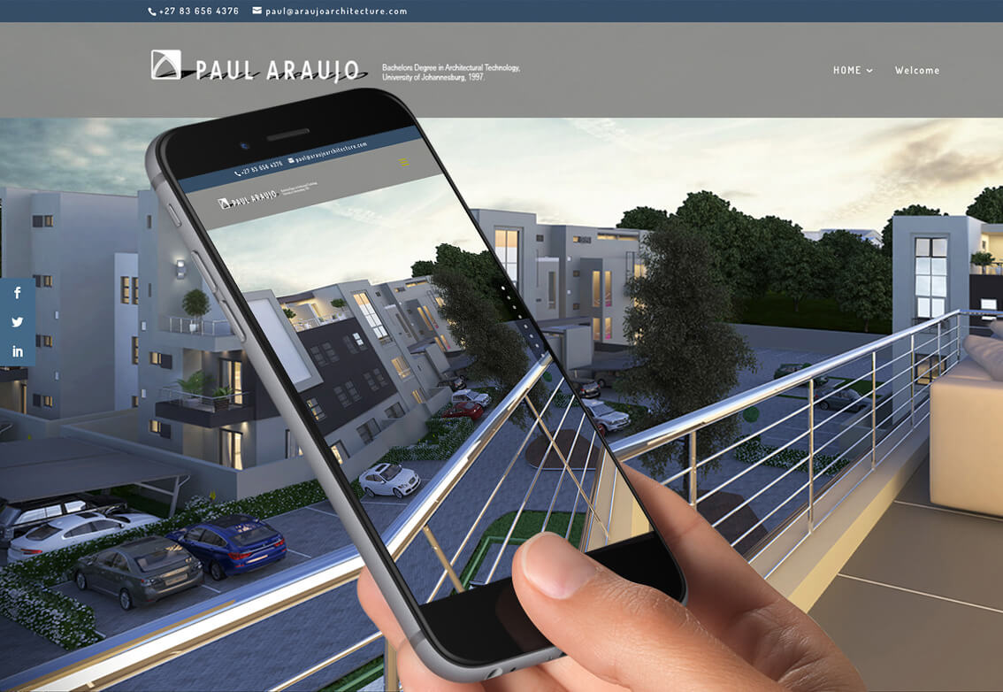
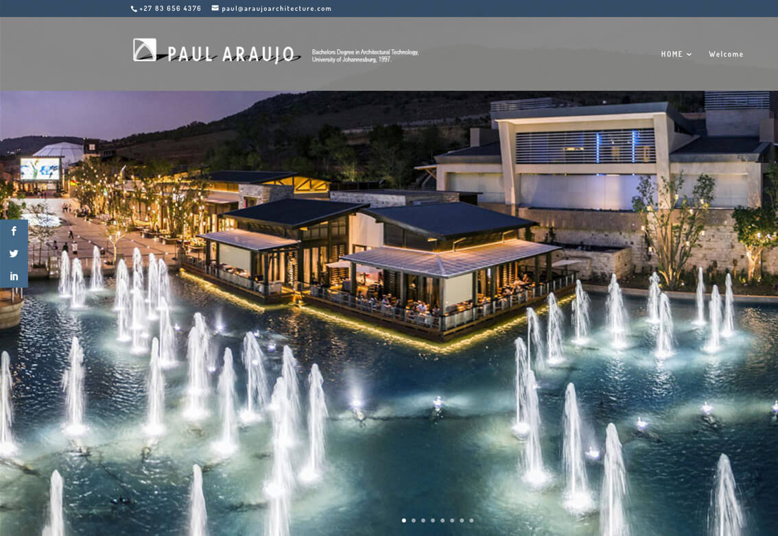
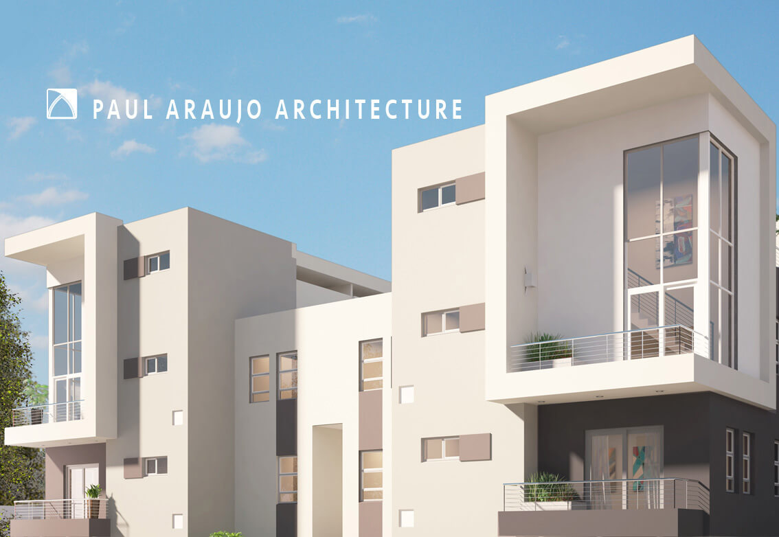
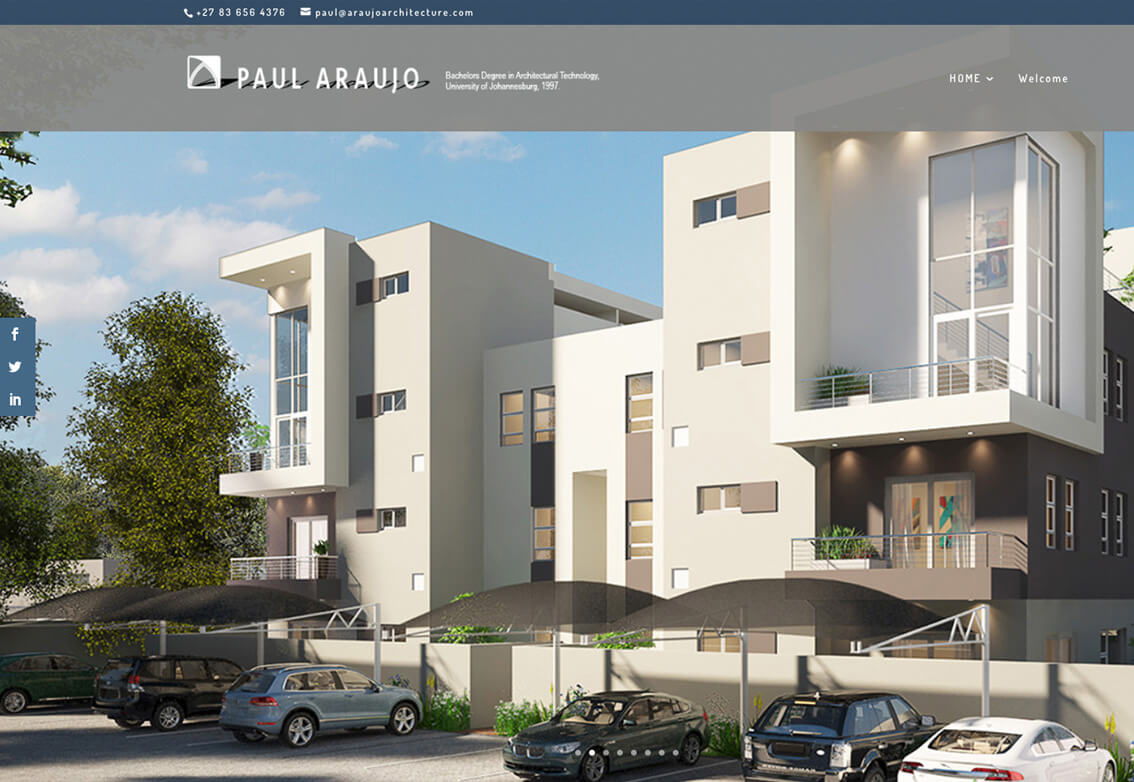
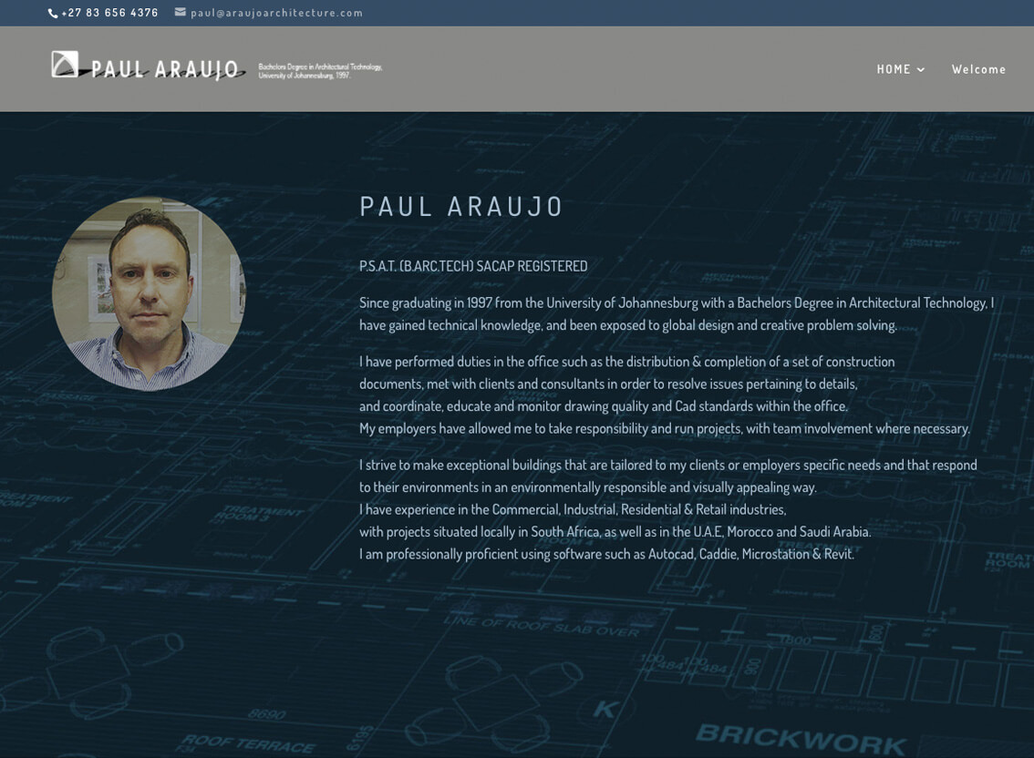
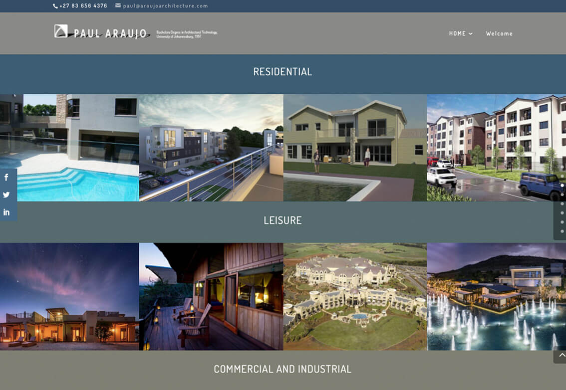
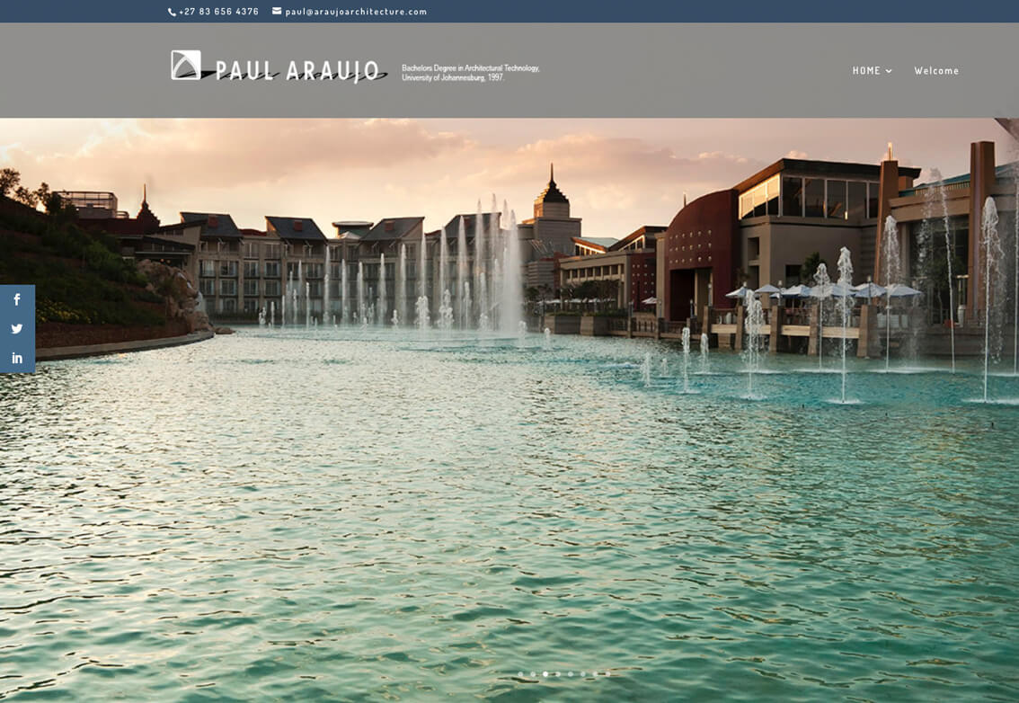
Website portfolio design
An architect in South Africa approached us to design him a stunning website design. First of all the most important aspect was going to be a website portfolio. Having tried to do it himself using wix, especially relevant he admitted that it just was not professional enough. He is thinking about working in New Zealand, hence the site needed to be of the highest standard. In his career he has worked on and produced some incredible buildings. It is rather impressive that he has international clients in Dubai, Morocco and South Africa consequently his website portfolio had to be very professional.
The Brief – His taste in design is very modern and contemporary due to his love of expensive houses. Clean lines and sophisticated colours are also vital but especially relevant they must be ultra modern. He has incredible images of stunning buildings and resorts.
A large full width image gallery seemed like a perfect inclusion. This is website portfolio had to hit the design heights worthy of a top internationally recognised Architect. Needless to say we needed to use all our skills and resources to produce something really special. The use of menus and sliders along with superb accent and complimentary colours were used to create a smart and professional look. As a result it is worthy of a well established, talented Architect.
A successful website portfolio
Well the results were absolutely breathtaking to say the least. We used one of his technical drawings, changed the colours while adjusting the 3D scale. Consequently we used it as the backdrop for his profile. Finally we added a picture of him in a round shape, slightly translucent. Especially relevant it created a futuristic feeling of depth. As a result this project has attracted another two new international clients just hours after its inclusion into our website portfolio.
In conclusion, we split the projects up into three categories and introduced a slider. We used smaller images as buttons. This solution firstly shows off his images again and also creates a gateway into the project. Another wonderful project we loved working on. If you would like to see it, go to www.araujoarchitecture.com
Website portfolio design projects
If you are looking for a stylish, contemporary, easy to navigate website with or without a portfolio, give us a try. Our work is as diverse as our clients are and in addition, each site has its own unique identity. If your site lacks that something special, why not contact us for a chat about how important your logo is. A logo is the starting point to the rest of your designs so make sure it represents your company well.
Deprecated: Creation of dynamic property ET_Builder_Module_Helper_MultiViewOptions::$inherited_props is deprecated in /home/linweb13/g/graphicidea.co.uk-1057514441/user/htdocs/wp-content/themes/Divi/includes/builder/module/helpers/MultiViewOptions.php on line 686
Deprecated: Creation of dynamic property ET_Builder_Module_Helper_MultiViewOptions::$inherited_props is deprecated in /home/linweb13/g/graphicidea.co.uk-1057514441/user/htdocs/wp-content/themes/Divi/includes/builder/module/helpers/MultiViewOptions.php on line 686
Deprecated: Creation of dynamic property ET_Builder_Module_Helper_MultiViewOptions::$inherited_props is deprecated in /home/linweb13/g/graphicidea.co.uk-1057514441/user/htdocs/wp-content/themes/Divi/includes/builder/module/helpers/MultiViewOptions.php on line 686
Deprecated: Creation of dynamic property WP_Post::$image_alt_text is deprecated in /home/linweb13/g/graphicidea.co.uk-1057514441/user/htdocs/wp-content/themes/Divi/includes/builder/module/Gallery.php on line 466
Deprecated: Creation of dynamic property WP_Post::$image_src_full is deprecated in /home/linweb13/g/graphicidea.co.uk-1057514441/user/htdocs/wp-content/themes/Divi/includes/builder/module/Gallery.php on line 467
Deprecated: Creation of dynamic property WP_Post::$image_src_thumb is deprecated in /home/linweb13/g/graphicidea.co.uk-1057514441/user/htdocs/wp-content/themes/Divi/includes/builder/module/Gallery.php on line 468
Deprecated: Creation of dynamic property ET_Builder_Module_Helper_MultiViewOptions::$inherited_props is deprecated in /home/linweb13/g/graphicidea.co.uk-1057514441/user/htdocs/wp-content/themes/Divi/includes/builder/module/helpers/MultiViewOptions.php on line 686
Logo and graphic design
Simpsons Interiors – Here we had a wonderful chance to do a full update of his graphic design and brand. A Surrey based Interior design studio ready for a change. Our client had a roman pillar in their last logo and wanted to use that with a refreshed look.
The Brief – Their brand design had to be upmarket and very professional while making use of high end graphic design and photography. The use of photoshop was a big plus for this design company.
Graphic elements
We kept the roman pillar in the logo and used it throughout their corporate brand design. We wanted to add a little extra wow factor to the envelope design that would make people excited to open it. An orange round sticker was introduced with their logo icon on it as a seal for the envelope.
Graphic branding design
We fulfilled the graphic design brief and consequently everybody loved the brand design. We have created an array of graphic design for Simpsons Interiors including stationery, branding design and a responsive website.
Apple Mac setup and training
We also kitted out his entire design studio in surrey with new Apple Macs, iPads and iPhones. All had to work seemlessly with calendars, contacts and business email addresses due to the fact that they are on site a lot of the time. This went very well and so we se up an easy-to-use Apple Airport Time Capsule for all backups.
The back up is very easy to retrieve and it feels like you are travelling back in time. Finally this was a big change so we provided some much needed Apple Mac training which they all enjoyed. It made life a lot easier. Months later they said they would never go back to the old way of working again.
In conclusion they were very impressed with the fact that their iPhone was now also digital diary with alerts for appointments and meetings. This client was using a paper diary before and now he would never go back to paper. We enjoyed helping make life a little easier for the staff at Simpsons Interiors.
They have been our graphic design clients since 2007.